
728x90
★ Display
- flex box, flexialbe box
- 레이아웃 구성 > 내부 요소의 배치
- float / position / margin
- 기본 상태(display : flex)
- 메인축 방향 : 가로(아이템이 나열되는 방향)
- 수직축 방향 : 세로
- 아이템 크기 : 너비(요소 크기만큼)
- 아이템 크기 : 높이(부모 크기만큼)
- 아이템 크기 : 메인축(요소 크기만큼)
- 아이템 크기 : 수직축(부모 크기만큼)
display : flex;- 실행 결과

- 기존 방법 1 : float를 사용 하였을 경우
#box::after {
    content:'';
    display : block;
    clear:left;
}

#box .item {
    float : left;
}- 기존 방법 2 : display : inline을 사용하였을 경우
#box {
    font-size : 0px;
}

#box .item {
    display: inline;
}- flex-direction
- 메인축 방향을 지정하는 속성
/* flex-direction : row; */ 기본값
flex-direction : column;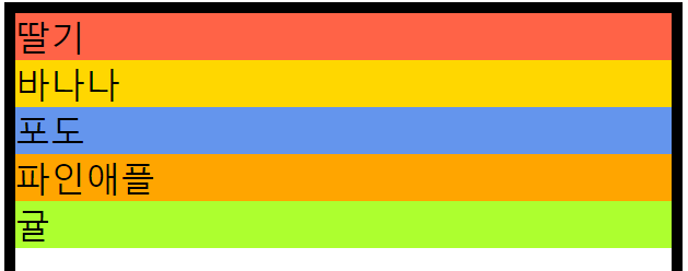
flex-direction : row-reverse;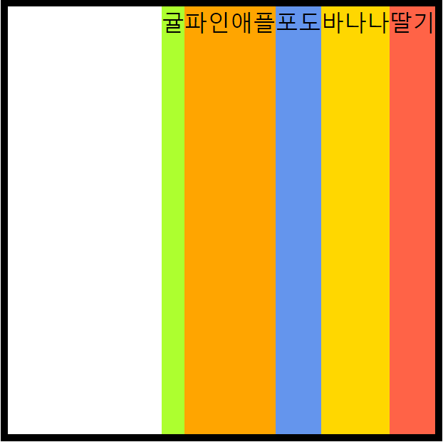
flex-direction : column-reverse;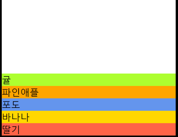
- flex-wrap
- 자동 줄바꿈
flex-wrap : nowrap; /* 줄바꿈을 하지 않는다 */
flex-wrap : wrap; /* 줄바꿈을 한다 */
flex-wrap : wrap-reverse; /* 줄바꿈을 하여 반대로 뒤집는다 */
★ flex 속성명
- 1. justify-XXX
- 메인축 방향 관련된 속성
- 2. align-XXX
- 수직축 방향 관련된 속성
- justify-content
- 메인축 방향 > 아이템 정렬
justify-content : flex-start;	/* 메인축의 좌측 정렬 */
justify-content : flex-end; /* 메인축의 우측 정렬 */- 균등 배치
- justify-content : space-xxx
justify-content: space-between; /* 양쪽으로 꽉채워서 균등 배분 */
justify-content: space-around;
justify-content: space-evenly;- align-items
- 수직축 방향 > 아이템 정렬
- justify-content와 동일하지만, 방향이 다름.
align-items : stretch; /* 기본 값 */
align-items : flex-start; /*위로 정렬*/
align-items : flex-end; /*아래로 정렬*/
align-items : center;	/*가운데 정렬 */
■ HTML 코드
<body>
    <div id="box">
        <div class="item">딸기</div>
        <div class="item">바나나</div>
        <div class="item">포도</div>
        <div class="item">파인애플</div>
        <div class="item">귤</div>
    </div>
</body>■ CSS 코드
<style>
    #box {
        border : 10px solid #000;
    }

    #box .item {
        font-size : 2rem;
    }

    #box .item:nth-child(1) {background-color: tomato;}
    #box .item:nth-child(2) {background-color: gold;}
    #box .item:nth-child(3) {background-color: cornflowerblue;}
    #box .item:nth-child(4) {background-color: orange;}
    #box .item:nth-child(5) {background-color: greenyellow;}
</style>
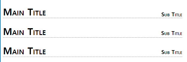
■ 응용 ex) 제목과 부제목의 위치를 정렬
- HTML 코드
<h1 id="title1">Main Title <small>Sub Title</small></h1>
<h1 id="title2">Main Title <small>Sub Title</small></h1>
<h1 id="title3">Main Title <small>Sub Title</small></h1>- CSS 코드
/* 방법 1 : float 사용 */
#title1 small {
    float : right;
    margin-top : 18px;
}

/* 방법 2 : position 사용 */
#title2 small {
    position : relative;
    left : 375px;
}

/* 방법 3 : display:flex 사용 */
#title3 {
    display: flex;
    align-items: flex-end;
    justify-content: space-between;
}- 실행 결과
■ 응용 ex2) 자식 상자를 부모상자의 가운데로 위치
- HTML 코드
<div id="parent">
        <div id="child"></div>
</div>- CSS 코드
- 방법 1 : padding과 margin을 이용한 가운데 정렬
#parent {
    width: 400px;
    height: 400px;
    background-color: gold;
    box-sizing : border-box;
    padding-top : 150px;
}

#child {
    width : 100px;
    height: 100px;
    background-color: cornflowerblue;
    margin : 0 auto;
}- 방법 2 : position을 이용한 가운데 정렬
#parent {
    width: 400px;
    height: 400px;
    background-color: gold;
}

#child {
    width : 100px;
    height: 100px;
    background-color: cornflowerblue;
    position : relative;
    left : 150px;
    top : 150px;
}- 방법 3 : flex를 이용
#parent {
    width: 400px;
    height: 400px;
    background-color: gold;
    display : flex;
    justify-content: center;
    align-items: center;
}

#child {
    width : 100px;
    height: 100px;
    background-color: cornflowerblue;
}- 실행 결과

728x90
'웹페이지' 카테고리의 다른 글
| CSS STEP 30 - Transition 응용 예제 모음 (0) | 2023.04.19 |
|---|---|
| CSS STEP 29 - Transition (0) | 2023.04.19 |
| CSS STEP 27 - OutLine (0) | 2023.04.18 |
| CSS STEP 26 - Transform (0) | 2023.04.18 |
| CSS STEP 25 - Column (0) | 2023.04.18 |
728x90
★ Display
- flex box, flexialbe box
- 레이아웃 구성 > 내부 요소의 배치
- float / position / margin
- 기본 상태(display : flex)
- 메인축 방향 : 가로(아이템이 나열되는 방향)
- 수직축 방향 : 세로
- 아이템 크기 : 너비(요소 크기만큼)
- 아이템 크기 : 높이(부모 크기만큼)
- 아이템 크기 : 메인축(요소 크기만큼)
- 아이템 크기 : 수직축(부모 크기만큼)
display : flex;- 실행 결과
- 기존 방법 1 : float를 사용 하였을 경우
#box::after {
    content:'';
    display : block;
    clear:left;
}

#box .item {
    float : left;
}- 기존 방법 2 : display : inline을 사용하였을 경우
#box {
    font-size : 0px;
}

#box .item {
    display: inline;
}- flex-direction
- 메인축 방향을 지정하는 속성
/* flex-direction : row; */ 기본값
flex-direction : column;
flex-direction : row-reverse;flex-direction : column-reverse;- flex-wrap
- 자동 줄바꿈
flex-wrap : nowrap; /* 줄바꿈을 하지 않는다 */
flex-wrap : wrap; /* 줄바꿈을 한다 */
flex-wrap : wrap-reverse; /* 줄바꿈을 하여 반대로 뒤집는다 */
★ flex 속성명
- 1. justify-XXX
- 메인축 방향 관련된 속성
- 2. align-XXX
- 수직축 방향 관련된 속성
- justify-content
- 메인축 방향 > 아이템 정렬
justify-content : flex-start;	/* 메인축의 좌측 정렬 */
justify-content : flex-end; /* 메인축의 우측 정렬 */- 균등 배치
- justify-content : space-xxx
justify-content: space-between; /* 양쪽으로 꽉채워서 균등 배분 */
justify-content: space-around;
justify-content: space-evenly;- align-items
- 수직축 방향 > 아이템 정렬
- justify-content와 동일하지만, 방향이 다름.
align-items : stretch; /* 기본 값 */
align-items : flex-start; /*위로 정렬*/
align-items : flex-end; /*아래로 정렬*/
align-items : center;	/*가운데 정렬 */
■ HTML 코드
<body>
    <div id="box">
        <div class="item">딸기</div>
        <div class="item">바나나</div>
        <div class="item">포도</div>
        <div class="item">파인애플</div>
        <div class="item">귤</div>
    </div>
</body>
■ CSS 코드
<style>
    #box {
        border : 10px solid #000;
    }

    #box .item {
        font-size : 2rem;
    }

    #box .item:nth-child(1) {background-color: tomato;}
    #box .item:nth-child(2) {background-color: gold;}
    #box .item:nth-child(3) {background-color: cornflowerblue;}
    #box .item:nth-child(4) {background-color: orange;}
    #box .item:nth-child(5) {background-color: greenyellow;}
</style>
■ 응용 ex) 제목과 부제목의 위치를 정렬
- HTML 코드
<h1 id="title1">Main Title <small>Sub Title</small></h1>
<h1 id="title2">Main Title <small>Sub Title</small></h1>
<h1 id="title3">Main Title <small>Sub Title</small></h1>- CSS 코드
/* 방법 1 : float 사용 */
#title1 small {
    float : right;
    margin-top : 18px;
}

/* 방법 2 : position 사용 */
#title2 small {
    position : relative;
    left : 375px;
}

/* 방법 3 : display:flex 사용 */
#title3 {
    display: flex;
    align-items: flex-end;
    justify-content: space-between;
}- 실행 결과
■ 응용 ex2) 자식 상자를 부모상자의 가운데로 위치
- HTML 코드
<div id="parent">
        <div id="child"></div>
</div>- CSS 코드
- 방법 1 : padding과 margin을 이용한 가운데 정렬
#parent {
    width: 400px;
    height: 400px;
    background-color: gold;
    box-sizing : border-box;
    padding-top : 150px;
}

#child {
    width : 100px;
    height: 100px;
    background-color: cornflowerblue;
    margin : 0 auto;
}- 방법 2 : position을 이용한 가운데 정렬
#parent {
    width: 400px;
    height: 400px;
    background-color: gold;
}

#child {
    width : 100px;
    height: 100px;
    background-color: cornflowerblue;
    position : relative;
    left : 150px;
    top : 150px;
}- 방법 3 : flex를 이용
#parent {
    width: 400px;
    height: 400px;
    background-color: gold;
    display : flex;
    justify-content: center;
    align-items: center;
}

#child {
    width : 100px;
    height: 100px;
    background-color: cornflowerblue;
}- 실행 결과
728x90
'웹페이지' 카테고리의 다른 글
| CSS STEP 30 - Transition 응용 예제 모음 (0) | 2023.04.19 |
|---|---|
| CSS STEP 29 - Transition (0) | 2023.04.19 |
| CSS STEP 27 - OutLine (0) | 2023.04.18 |
| CSS STEP 26 - Transform (0) | 2023.04.18 |
| CSS STEP 25 - Column (0) | 2023.04.18 |