웹페이지
CSS STEP 29 - Transition
IT의 큰손
2023. 4. 19. 12:14
728x90
★ 전환, Transition
- 객체의 속성(상태)값이 변화되는 과정을 시간 순서대로 보여주는 속성
- 수치형 속성에만 적용 가능(숫자, 색상)
- 사용방법
transition-property : width;
transition-duration: 1s;- 한줄로 타이핑 가능
transition : .5s all;
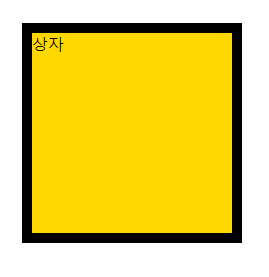
■ HTML 코드
<body>

    <div id="box">상자</div>

</body>
■ CSS 코드
<style>

    #box {
        border : 10px solid black;
        width : 200px;
        height: 200px;
        background-color: gold;
        margin : 100px;

        transition-property : width;
        transition-duration: 1s;
    }

    #box:hover {
        width : 400px;
    }

</style>
■ 실행 결과
■ 다양한 ex1)
#box {
    border : 10px solid black;
    width : 200px;
    height: 200px;
    background-color: gold;
    margin : 100px;

    transition-property : all;
    transition-duration: 10s;
}

#box:hover {
    width : 400px;
    height: 400px;
    background-color: tomato;
    /* font-size : 10rem; */ /* 폰트사이즈가 커짐 */
    /* opacity:0; */ /*보였다 안보였다 할 수 있음 */
    /* box-shadow : 10px 10px 5px #555; */
    /* margin-left : 200px; */
    /* padding : 100px */
    /* border-width : 50px; */
    /* left : 300px;
    top : 300px; */ /* 대각선 이동 */
    /* transform : translate(500px, 0px); */ /* 옆으로 이동 */
    /* transform : scale(-1,1); */ /* 한바퀴 돔 */
    /*transform : rotate(3600deg)*/ /* 360도 회전 */
}- 실행 결과

■ 다양한 ex2) 가속도 조절
- HTML 코드
<body>
    <div id="list">
        <!-- div#box$.box*5 -->
        <div id="box1" class="box">linear</div>
        <div id="box2" class="box">ease(default)</div>
        <div id="box3" class="box">ease-in</div>
        <div id="box4" class="box">ease-out</div>
        <div id="box5" class="box">ease-in-out</div>
    </div>

    <img src="images/catty01.png" id="cat">
</body>- 기본 CSS 코드
<style>
    #list {
        border : 1px solid black;
        width : 800px;
    }

    #list .box {
        width : 100px;
        height: 50px;
        margin : 15px 0;
    }

    #box1 {
        background-color: tomato;
    }
    #box2 {
        background-color: gold;
    }
    #box3 {
        background-color: orange;
    }
    #box4 {
        background-color: cornflowerblue;
    }
    #box5 {
        background-color: greenyellow;
    }

</style>- 추가 적인 CSS 코드
- 가속도를 조절하는 함수
- transition-timing-function : ease;

#box1 {
    background-color: tomato;
    transition-timing-function : linear;
}
#box2 {
    background-color: gold;
    transition-timing-function : ease;
}
#box3 {
    background-color: orange;
    transition-timing-function : ease-in;
}
#box4 {
    background-color: cornflowerblue;
    transition-timing-function : ease-out;
}
#box5 {
    background-color: greenyellow;
    transition-timing-function : ease-in-out;
}- transition-delay : 1s; > 1초 뒤에 시작함
#box1 {
    background-color: tomato;
    /* transition-timing-function : linear; */
    transition-delay : 0s;
}
#box2 {
    background-color: gold;
    /* transition-timing-function : ease; */
    transition-delay : 0.5s;
}
#box3 {
    background-color: orange;
    /* transition-timing-function : ease-in;*/
    transition-delay : 1s;
}
#box4 {
    background-color: cornflowerblue;
    /* transition-timing-function : ease-out; */
    transition-delay : 1.5s;
}
#box5 {
    background-color: greenyellow;
    /* transition-timing-function : ease-in-out; */
    transition-delay : 2s;
}- 고양이 이미지 ex)
#cat {
    transition-property: margin-left;
    transition-duration: 3s;
    transition-timing-function: cubic-bezier();
}

body:hover #cat {
    margin-left : 700px;
}
- 자세한 속도 조절
- transition-timing-function: cubic-bezier(0.075, 0.82, 0.165, 1);
- 실행 결과

■ 자주 사용 하는 ex)
- HTML 코드
<div id="box">
    <div>
        <img src="images/cat01.jpg">
        <img src="images/cat02.jpg">
        <img src="images/cat03.jpg">
        <img src="images/cat04.jpg">
        <img src="images/cat05.jpg">
    </div>
</div>- CSS 코드
<style>
    #box {
        border : 10px solid orange;
        width : 250px;
        height: 188px;
        overflow : hidden;
    }

    #box:hover > div {
        transform: translate(-750px, 0px);
    }

    #box > div {
        /* outline: 5px solid blue; */
        width : 1250px;
        display: flex;
        display : flex;
        transition : all 1s;
    }
</style>- 실행 결과

728x90